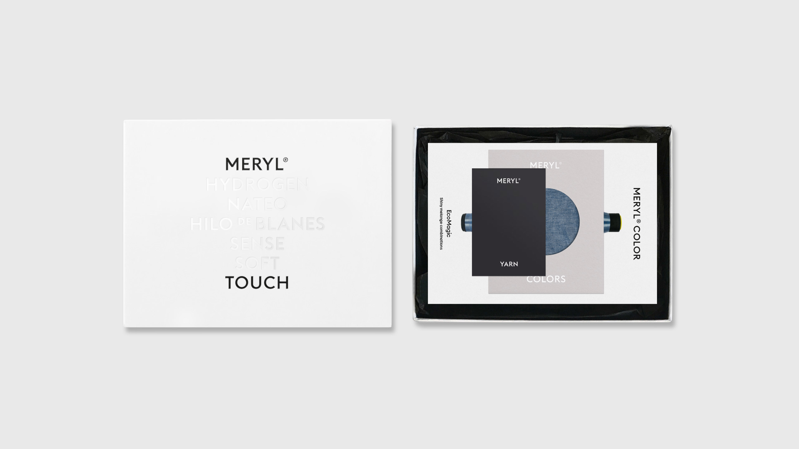
Fase, estudio de diseño gráfico. Identidad corporativa Meryl.

Meryl

Meryl

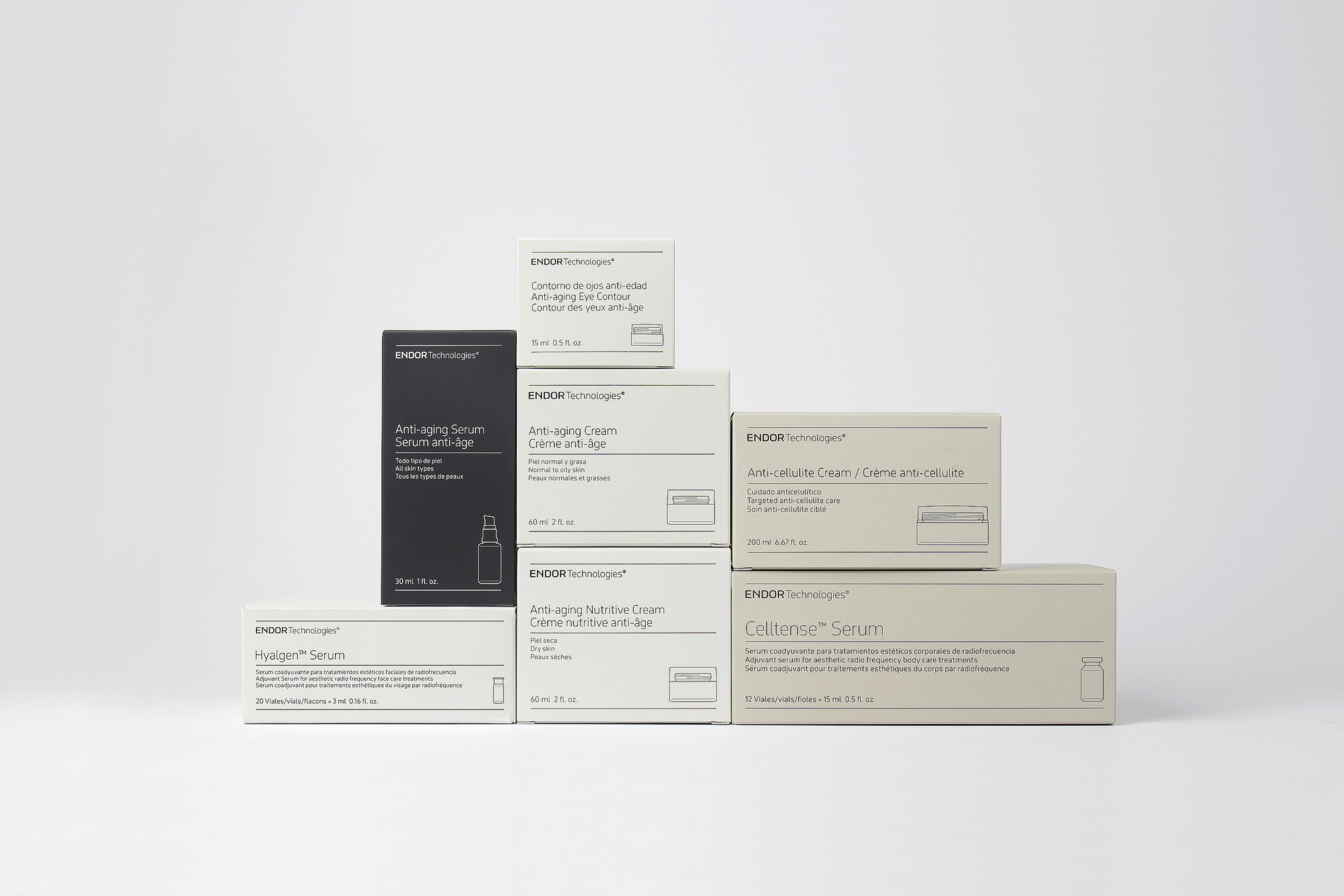
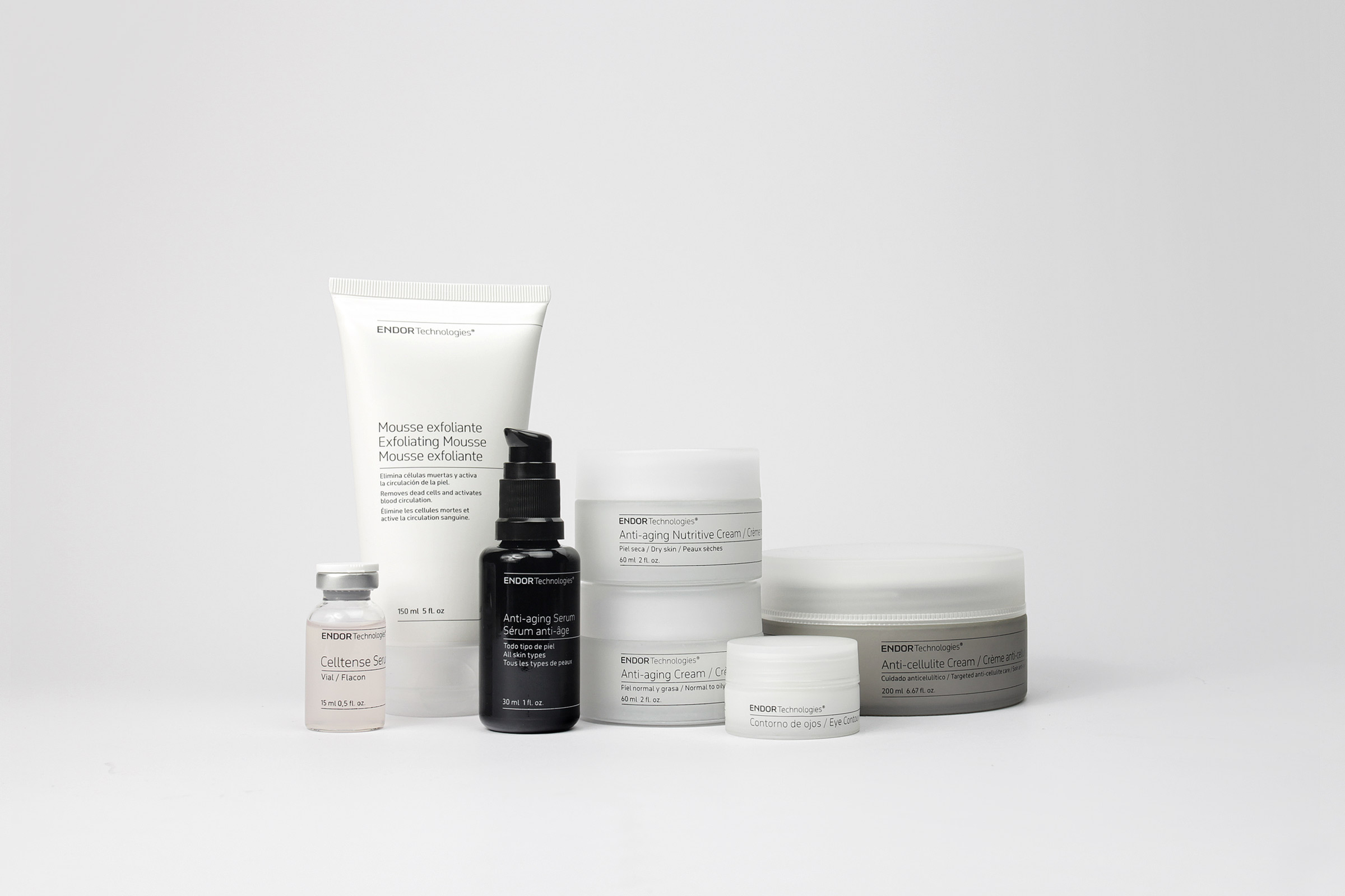
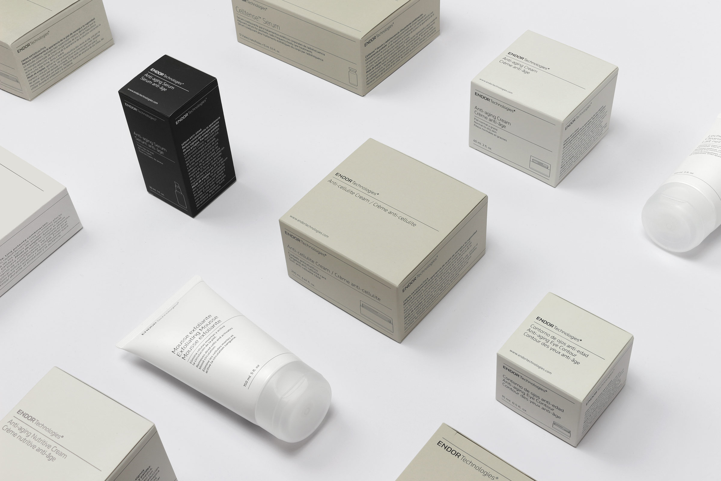
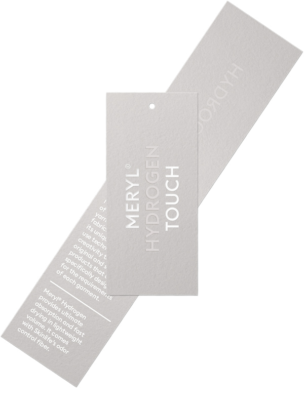
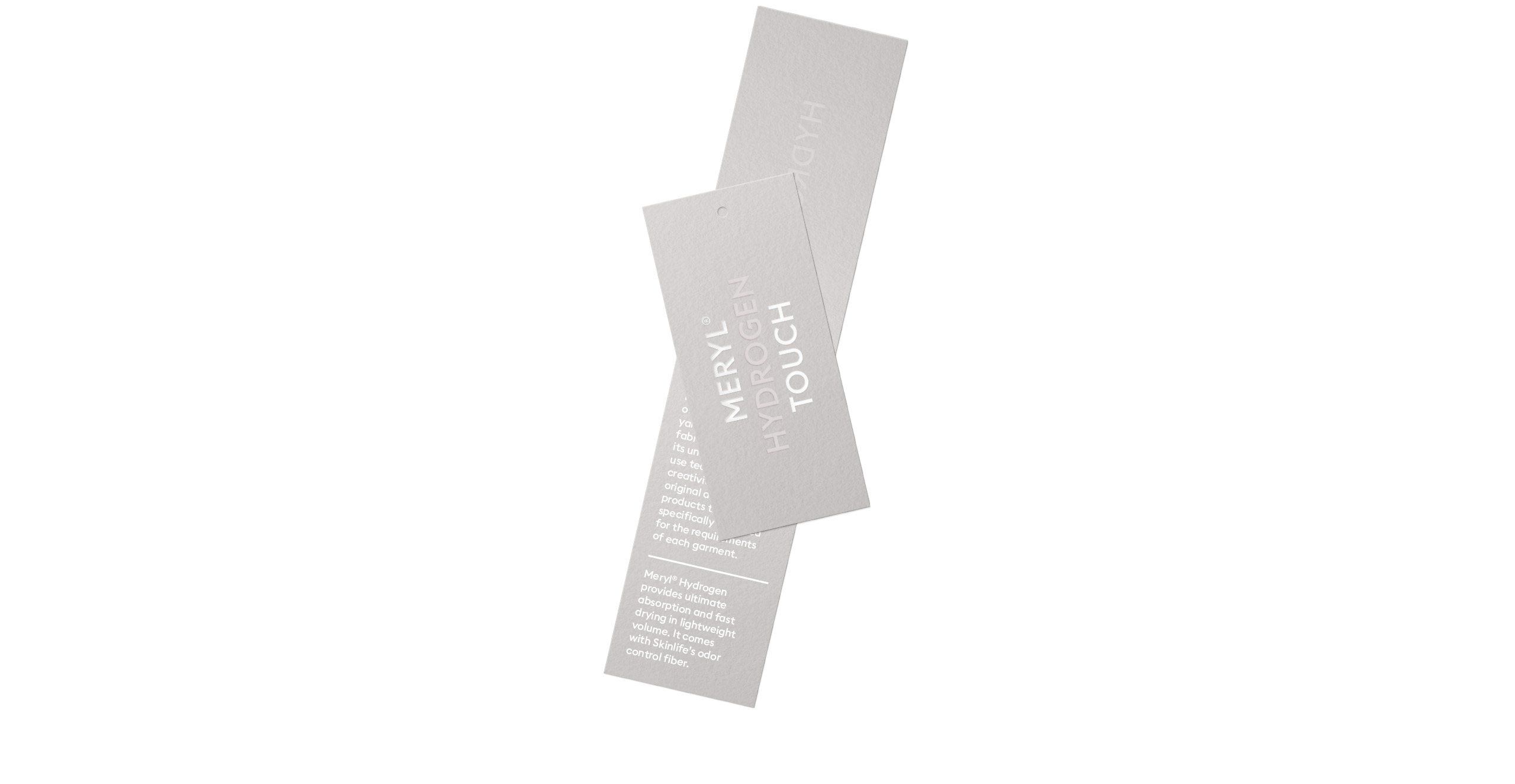
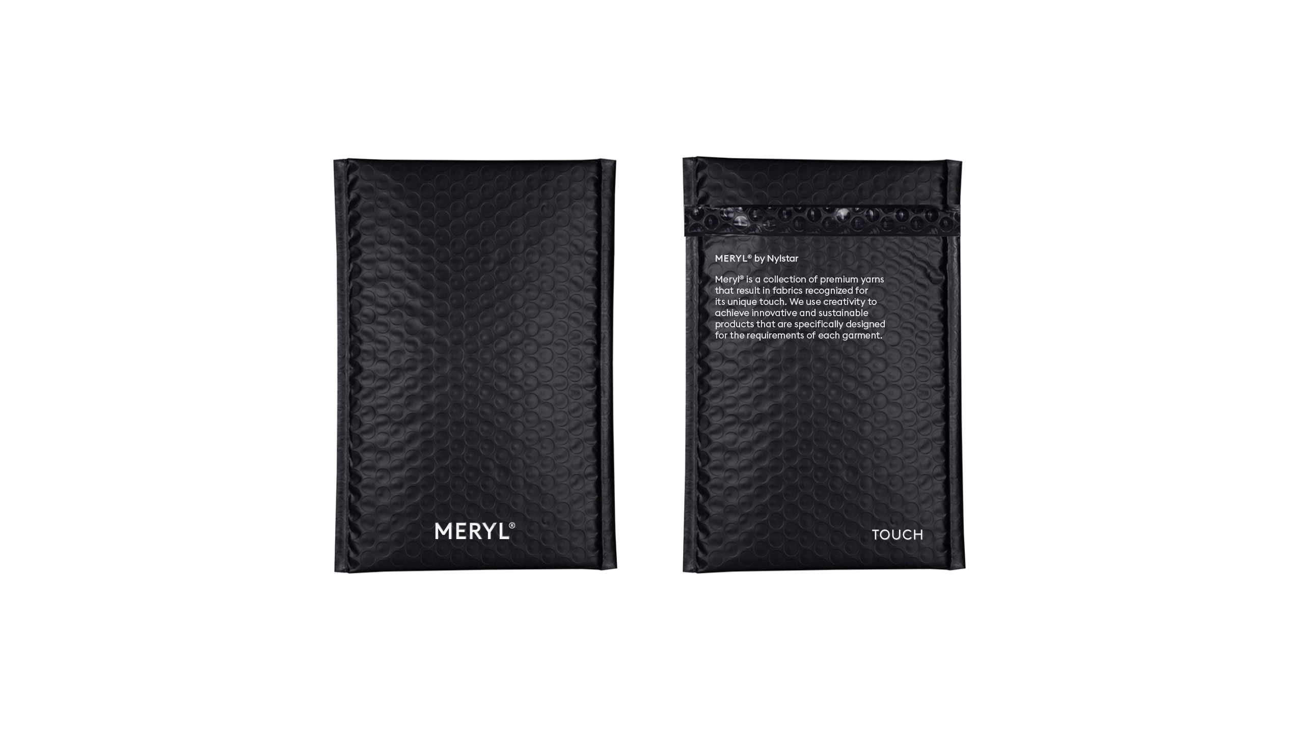
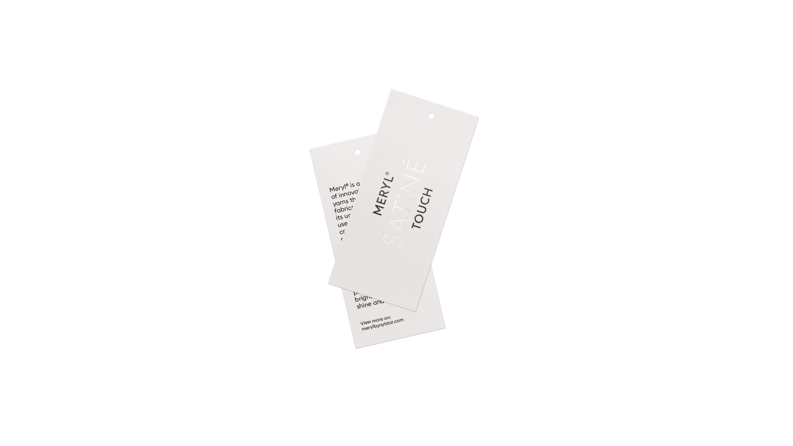
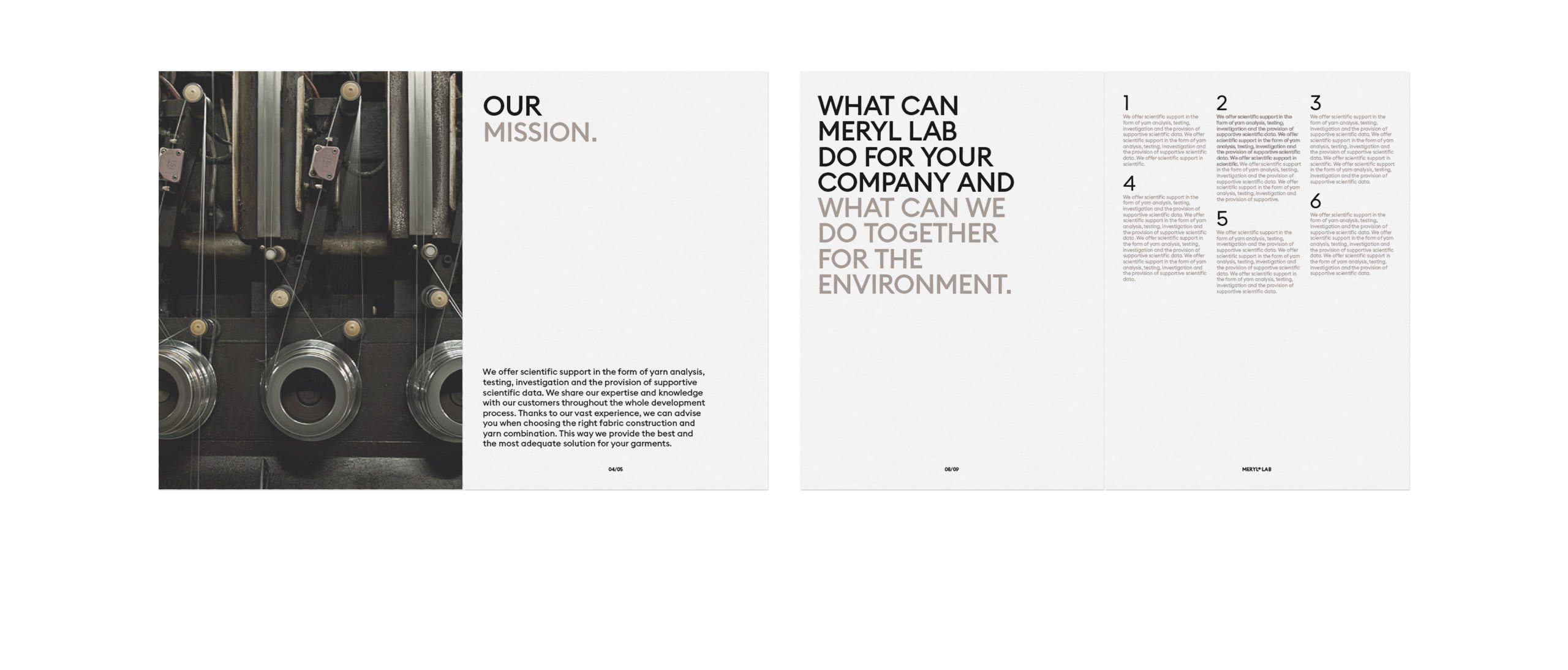
Meryl is a collection of innovative premium yarns traditionally crafted in Blanes (Spain) since 1925, that result in fabrics recognized for its unique touch. Likewise, the Meryl Lab division use technology and creativity in order to achieve original and sustainable products that are specifically designed for the requirements of each garment.

Fase, estudio de diseño gráfico. Identidad corporativa Meryl. Tarjeta.
Fase, estudio de diseño gráfico. Identidad corporativa Meryl. Hangtag Etiqueta.
Fase, estudio de diseño gráfico. Identidad corporativa Meryl. Sobres para envios.

Fase, estudio de diseño gráfico. Identidad corporativa Meryl. Hangtag etiqueta.

Fase, estudio de diseño gráfico. Identidad corporativa Meryl.
Fase, estudio de diseño gráfico. Identidad corporativa Meryl. Case Study.
Fase, estudio de diseño gráfico. Identidad corporativa Meryl. Dossier empresa.
Fase, estudio de diseño gráfico. Identidad corporativa Meryl. Dossier empresa

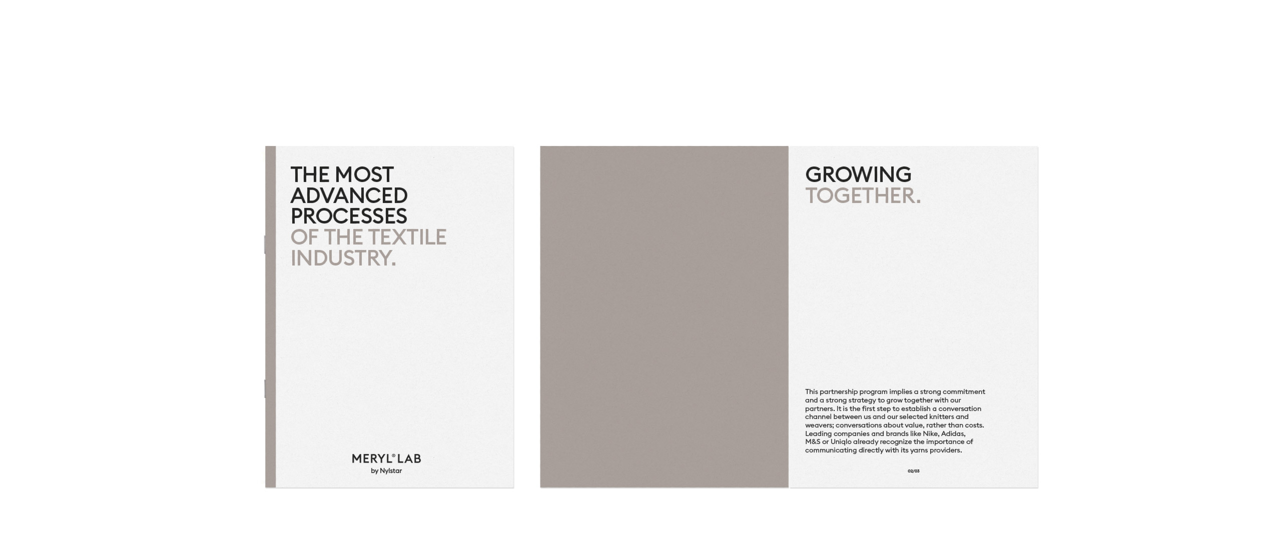
In addition to the redesign, we developed the new brand strategy for Meryl that consisted of achieving a reputation within the textile sector, gearing towards itself to the final market through mechanisms such as co-branding, to later be enshrined as an “ingredient brand” recognized and appreciated by the user.
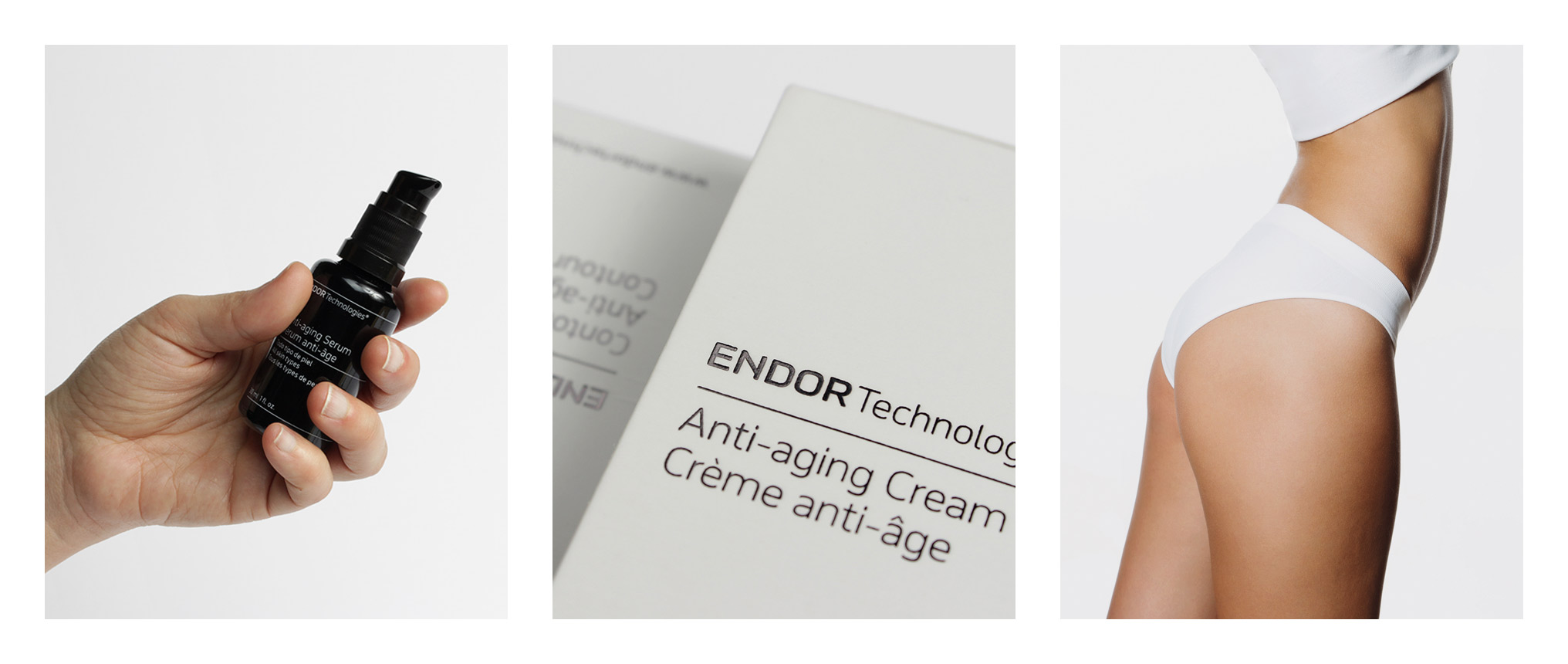
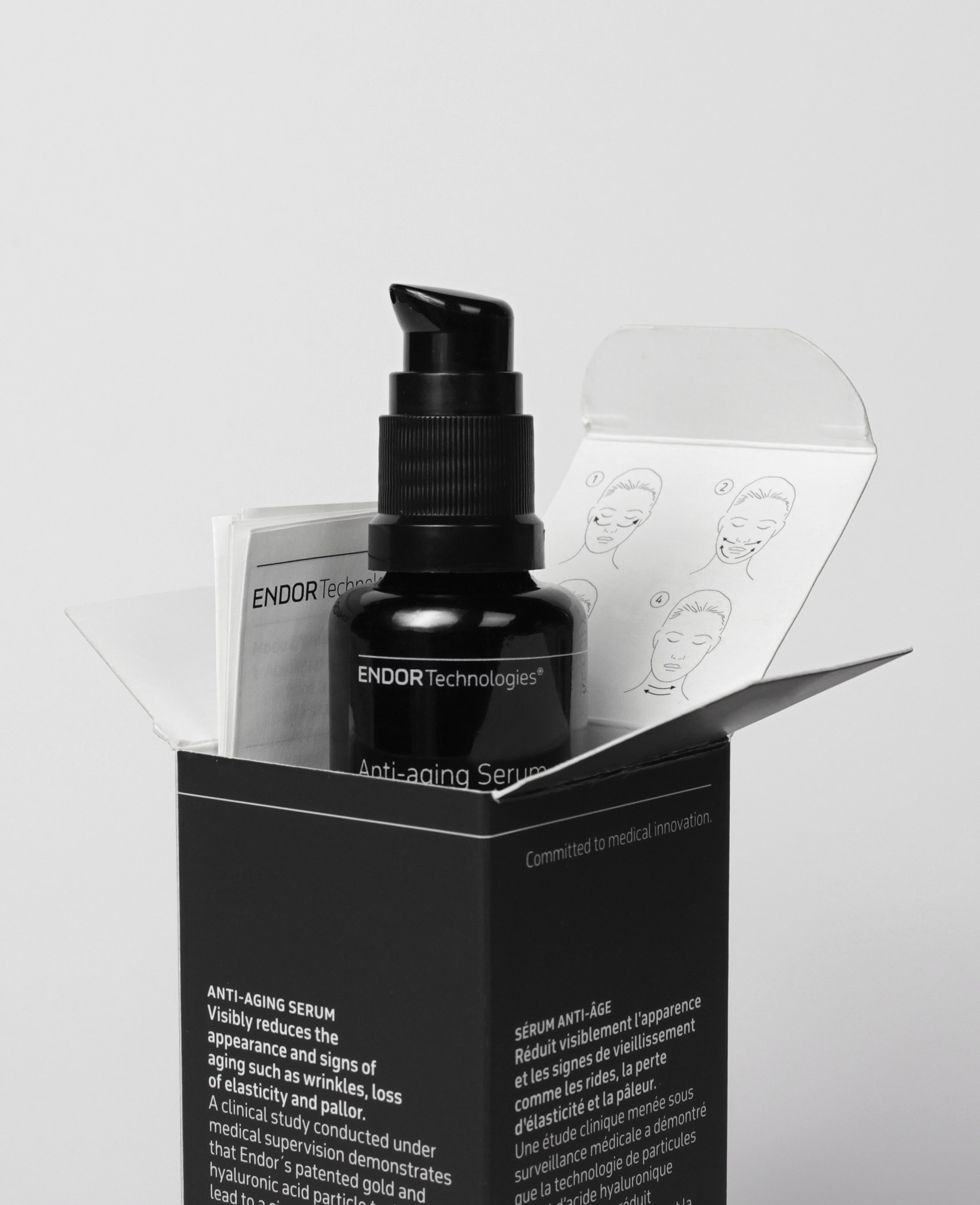
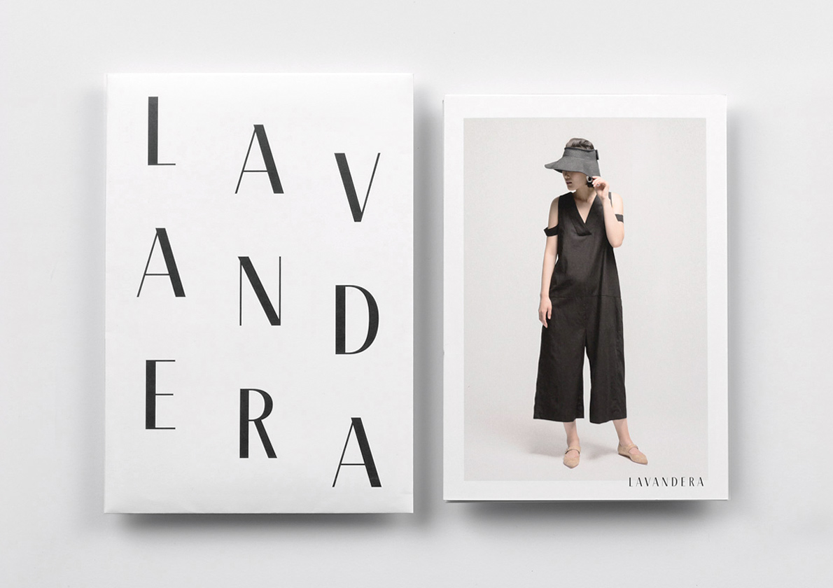
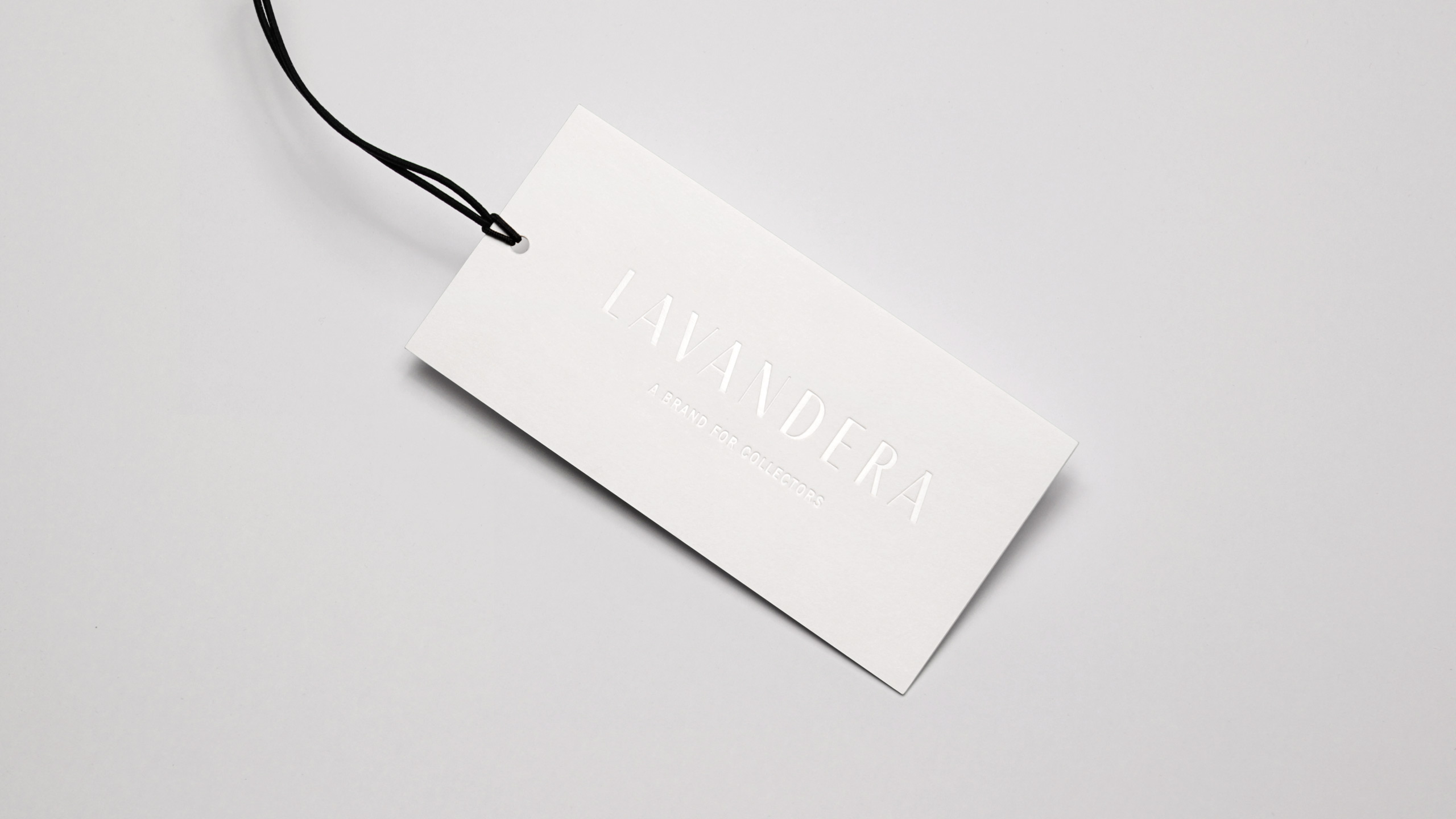
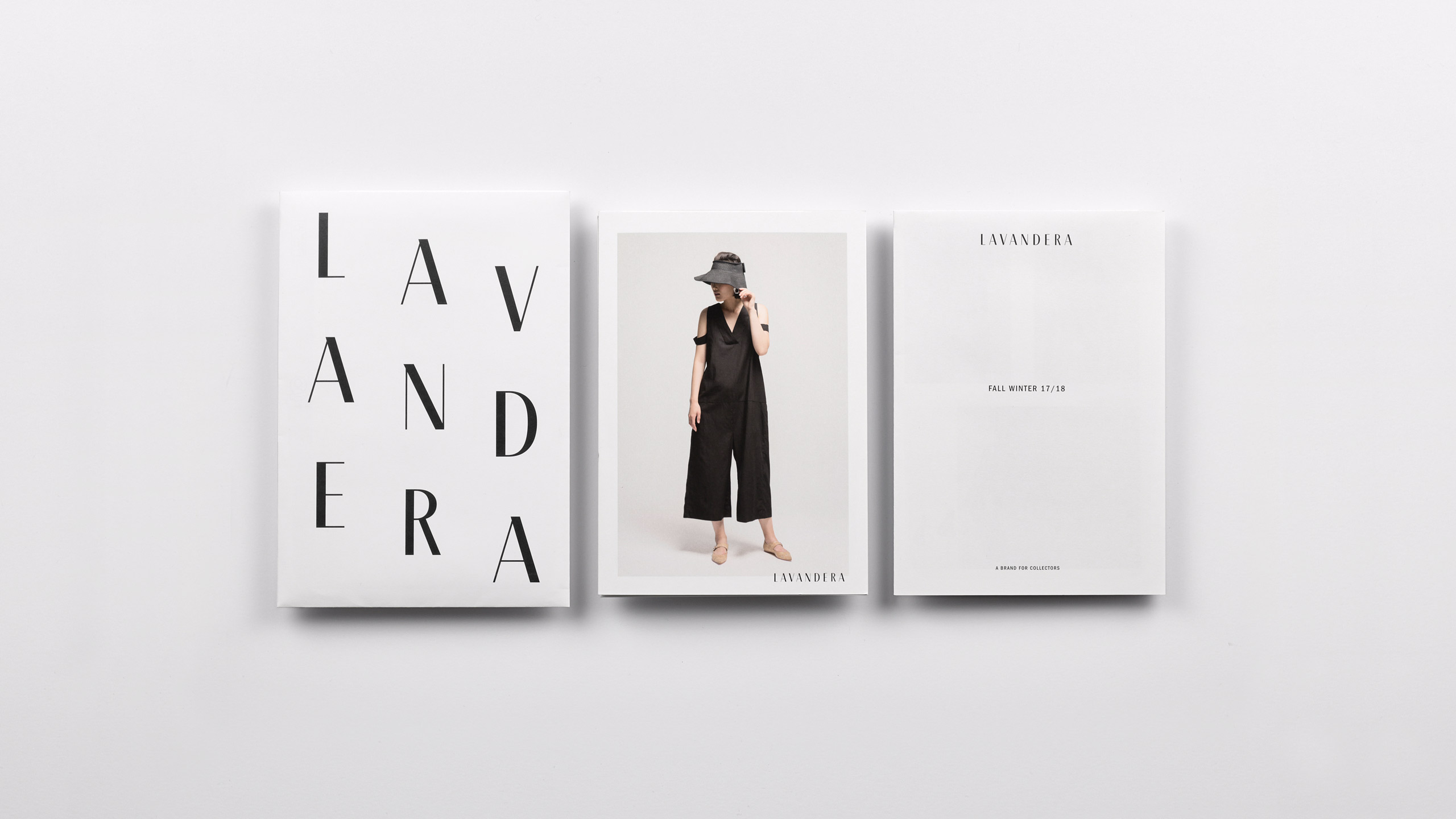
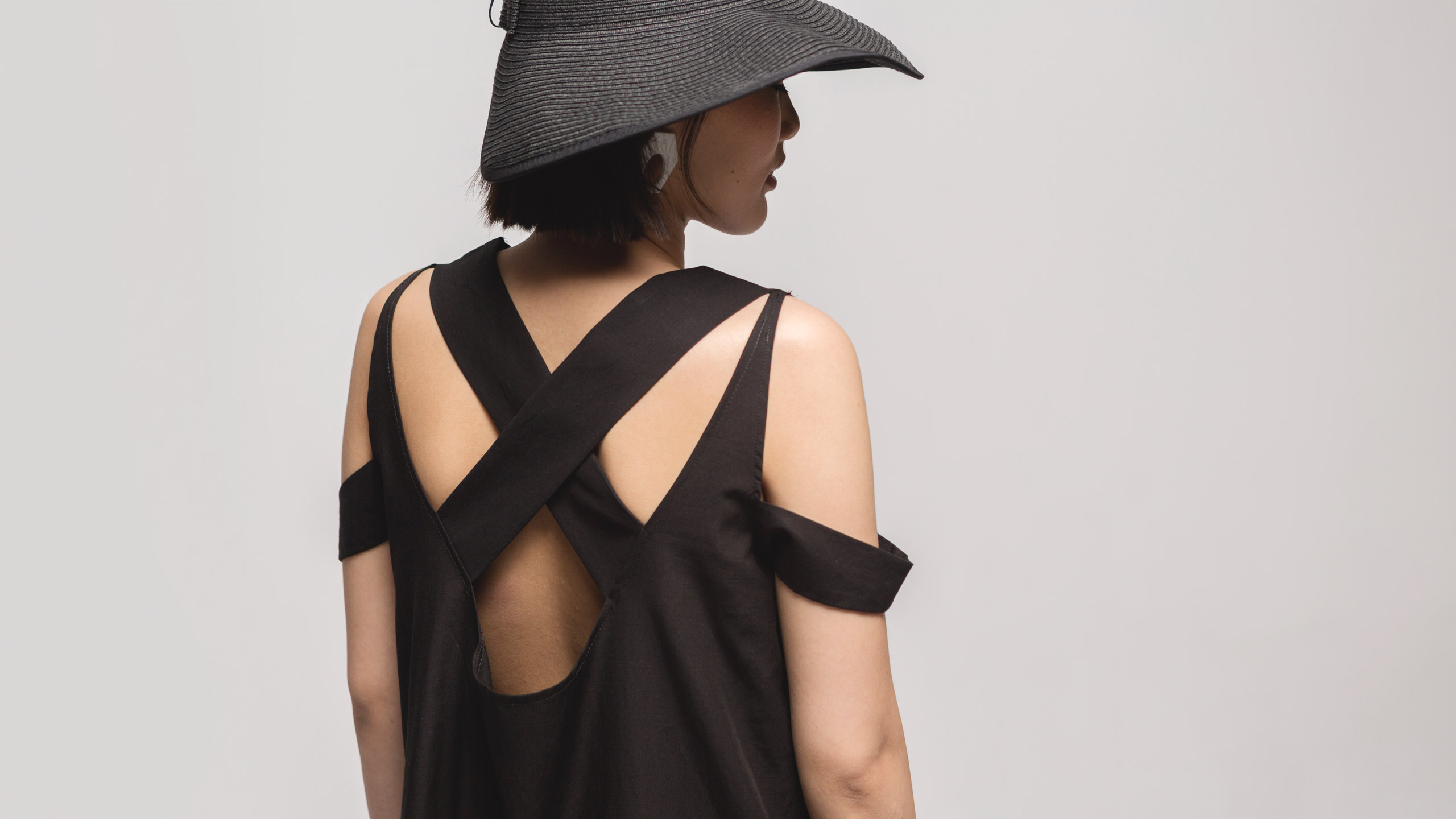
The touch was chosen as a differentiating element, since it functions as an emotional attribute and is the connecting value between the product and the user experience common to all its products. We support these premises with a sober visual language, without decorative elements and related to the fashion world, trying to update elements and classical compositions. In addition to the use of high quality materials and touch references finishes in order to strengthen the main message.

Fase, estudio de diseño gráfico. Identidad corporativa La Mercería, galería de arte. Thumbnail.

La Mercería, art gallery

La Mercería, art gallery

This art gallery was born in 2018 in the heart of València with the aim of exposing emerging artists work. The gallery is in the space previously occupied by a haberdashery (Mercería in spanish), still retaining the original signs, so it was decided to keep the name of “Mercería” for its new activity.

Fase, estudio de diseño gráfico. Identidad corporativa La Mercería, galería de arte. Postales Antonio Pineda.

The identity is based on a very simple idea: to transfer the frontal view of the gallery to a graphic system. In this way the window represents the space that the gallery provides the artist to show his work, while the door is the place established for the appellation. A model that adapts itself to the format of each material, and that incorporates the work as part of the identity. The color changes for each new exhibition, thus evidencing the change and enriching the identity. In the case of corporate materials, a simplified version that softens its personality is used.

Fase, estudio de diseño gráfico. Identidad corporativa y diseño de packaging para Endor Technologies. Sérum, caja y prospecto.

Endor Technologies

Endor Technologies

Endor Technologies is a biotechnology company that conduct medical research in the areas of oncology and dermatology with a collection of dermocosmetic products. In accordance with their new market strategy, they commissioned us to adapt their brand, their packaging design and an e-commerce website that will help them to be perceived as a dermatological product aimed at the international market.

Fase, estudio de diseño gráfico. Identidad corporativa y diseño de packaging para Endor Technologies. Cajas y envases.
Fase, estudio de diseño gráfico. Identidad corporativa y diseño de packaging para Endor Technologies. Texto.
Fase, estudio de diseño gráfico. Identidad corporativa y diseño de packaging para Endor Technologies. Iconos envases.
Fase, estudio de diseño gráfico. Identidad corporativa y diseño de packaging para Endor Technologies. Cajas y envases.
Fase, estudio de diseño gráfico. Identidad corporativa y diseño de packaging para Endor Technologies. Detalles.
Fase, estudio de diseño gráfico. Identidad corporativa y diseño de packaging para Endor Technologies. Cajas.
Fase, estudio de diseño gráfico. Identidad corporativa y diseño de packaging para Endor Technologies. Prospecto.
Fase, estudio de diseño gráfico. Identidad corporativa y diseño de packaging para Endor Technologies. Serum, caja y prospecto.
Fase, estudio de diseño gráfico. Identidad corporativa y diseño de packaging para Endor Technologies. Envases.
Fase, estudio de diseño gráfico. Identidad corporativa y diseño de packaging para Endor Technologies. Cajas y envases.
Fase, estudio de diseño gráfico. Identidad corporativa y diseño de packaging para Endor Technologies. Detalles.
Fase, estudio de diseño gráfico. Identidad corporativa y diseño de packaging para Endor Technologies. Web.
Fase, estudio de diseño gráfico. Identidad corporativa y diseño de packaging para Endor Technologies. Brand guidelines.

The main objective was to enhance the technology behind the products of Endor, and thus distance them from the concept of beauty with which many cosmetic brands and products are linked.

The solution was to approach the graphic language of the pharmaceutical products, arranging a three-line grid that is born in the brand and creates a continuous path that wrap the format on which it is applied. We chose November Std, a more human and delicate industrial typeface. Technical drawings were used to reinforce the technological product message. Finally, we selected an aseptic color range based on gray tones in order to differentiate the product families.

Fase, estudio de diseño gráfico. Identidad corporativa Lavandera, a brand for collectors. Thumbnail.

Lavandera, a brand for collectors

Lavandera, a brand for collectors

Lavandera was born more than 10 years ago as a fashion company for people who escape conventions, that want to create their own universe and that are alien to the frenetic rhythms of today’s society. All their garments are made in Spain and are labeled with a serial number which specifies the number of garments made per model. Lavandera escapes the collections that are born and die every six months, it is a brand for collectors.

Lavandera pursues an educational work, an approach between the people of the street and the most conceptual fashion. More than 10 years after, the ideology and aspirations with which it started have not changed, but its formalization has evolved, opening a more mature and polished path.

This was, our main goal in this brand redesign project. In this way, we seek to generate a cleaner and readable logo than the previous one, designing a lettering that like the brand’s garments, is a contrasts and details balance. We also added a claim, “A brand for collectors” referred to the limited edition of garments and their timeless spirit. Finally, for the identity, a sober and elegant cut was maintained but incorporating suggestive attitudes and a current language.

Fase, estudio de diseño gráfico. Identidad corporativa Blasco y Vila. Thumbnail.

Blasco&Vila

Blasco&Vila

Blasco&Vila (B&V) is a design company specialized in sofas and armchairs since 1992. Located in Moixent, Valencia, they make their own designs in a tapestry atelier that combines tradition, craftsmanship, passion, experience and creativity with the most advanced technology. In the year in which it turns 25 they celebrate it with an image renewal at all levels, also in his name and identity.

Fase, estudio de diseño gráfico. Identidad corporativa Blasco y Vila. Símbolo sobre imagen de producto.

They wanted their logo too look more stylish and smart. Besides the fundamental idea to communicate is the combination of tradition and modernity, a way of working that Blasco&Vila carry in their identity. Otherwise the image renewal required a more precise denomination: a name with more personality and that communicates better some of the company values, but they wanted to keep visible the short version, so it was proposed to solve the content of the initials and maintain the B&V as the main brand abbreviation.

We concluded that a typographic logo should be proposed, complemented by a more powerful visual language, but maintaining a sober and simple style. We opted for a Scottish Roman typography, a style originated in the early nineteenth century, in the search for a very effective and quality design under unfavorable printing conditions. Harriet Series is a typographic family that updates this spirit bringing it closer to new methods and guidelines. One of the key objectives was to downplay the ampersand, a symbol with a lot of visual force capable of minimizing its companions in the abbreviated version of the brand. We designed a personalized ampersand: sans serif, simple, nice shapes and with a cut that makes it even lighter.

The contrast of weights and the opposition between serif and sans typefaces was the solution, formally reflecting the idea of tradition-modernity, as well as achieving a result with the required personality.

Art direction: Pablo Gironés
Product photography: Ángel Segura
Fase, estudio de diseño gráfico. Identidad visual de Musix, proyecto de promoción cultural para la Generalitat Valenciana. Cartel

Mediterranew Musix

Mediterranew Musix

Musix is an institutional project for cultural promotion of Generalitat Valenciana; an umbrella brand which aims to situate Comunitat Valenciana as a benchmark in the international music circuit.

The identity should bring together all the Comunitat Valenciana’s musical offer, embrace festivals of different types and styles, approach to diverse national and international markets; have a strong tourism component and be able to coexist with a wide brands variety.

Èxit was the agency responsible for conducting the naming and verbal identity. Both teams worked together the concept: Comunitat Valenciana understood as a mix of music and cultures, a universal meeting point without losing its local character (musix/musics means musicians in Valencian).

Given the complexity of the assignment, rather than designing a brand, we generated a versatile graphic system to communicate that Comunitat Valenciana is a “Musix land” in various contexts. This system is built from a specific element (ligature) which is very adaptable for its ability to connect and put together different concepts.