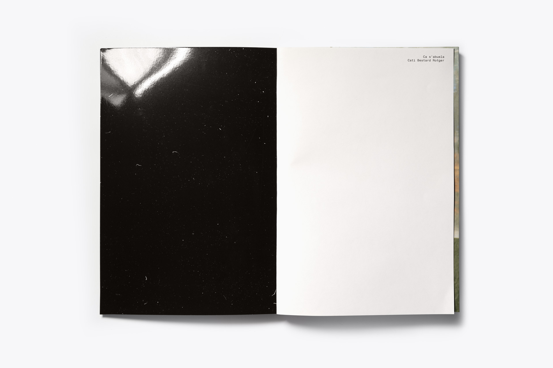
Fase, estudio de diseño gráfico. Publicación Ca s'abuela de Cati Bestard

Ca s’abuela

Ca s’abuela

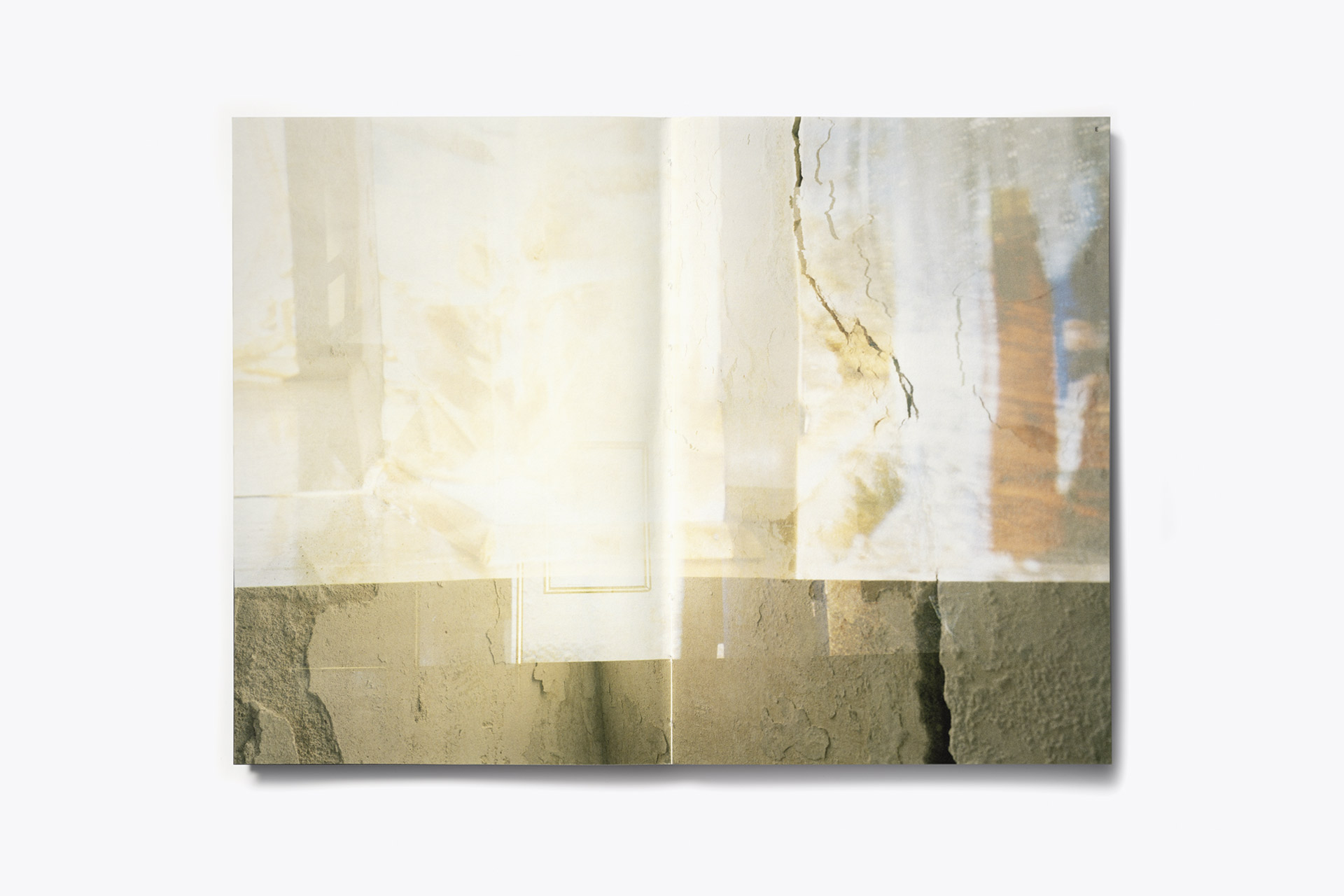
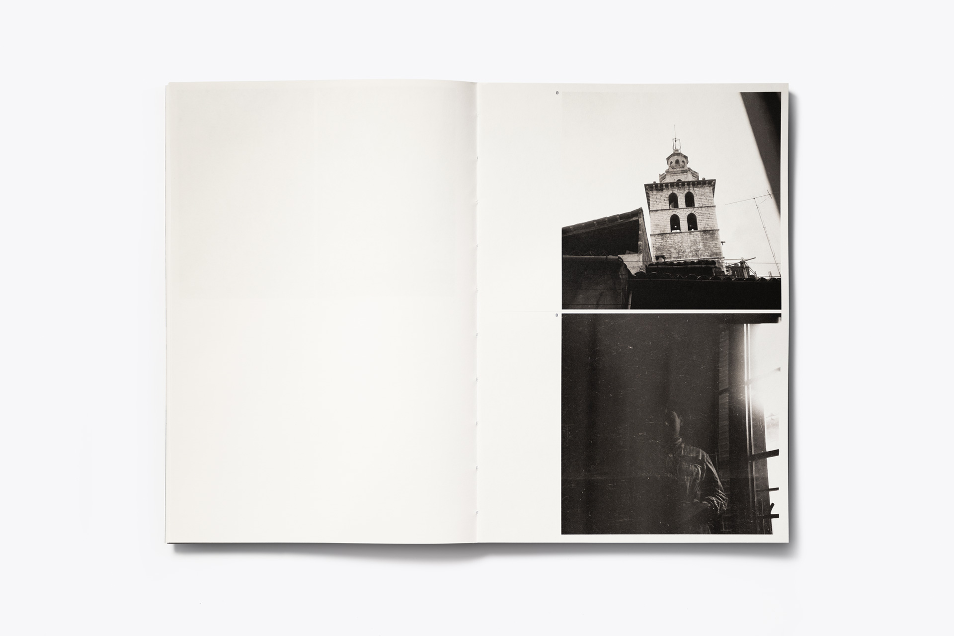
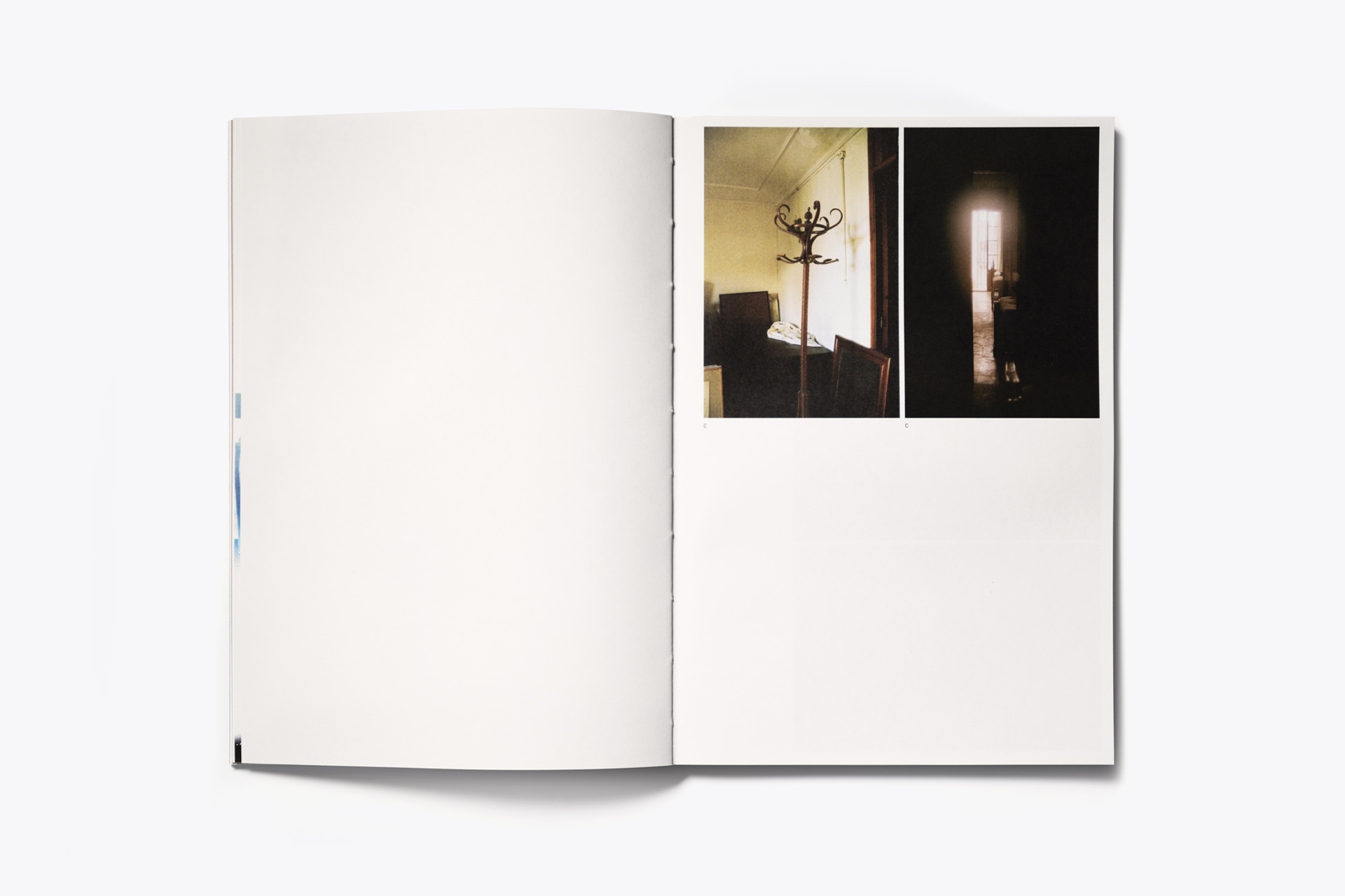
“Ca s’abuela” is a photobook by Cati Bestard about her grandmother’s house in Mallorca, Spain. It includes pictures taken by her dad in the 60’s, and pictures she took between 2017 and 2021.

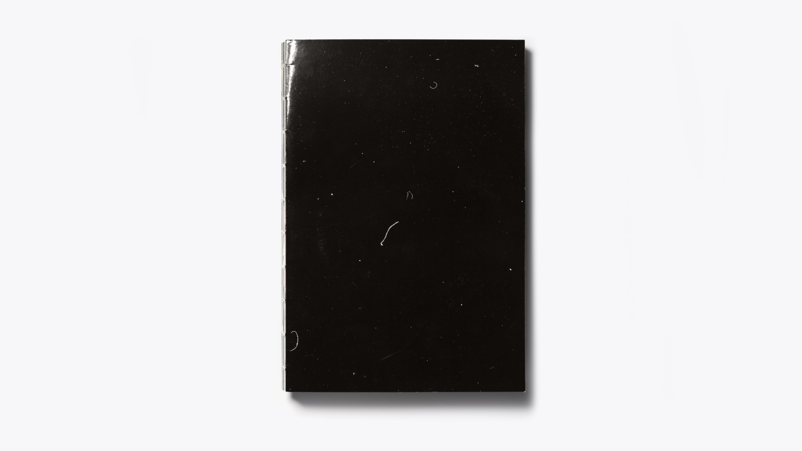
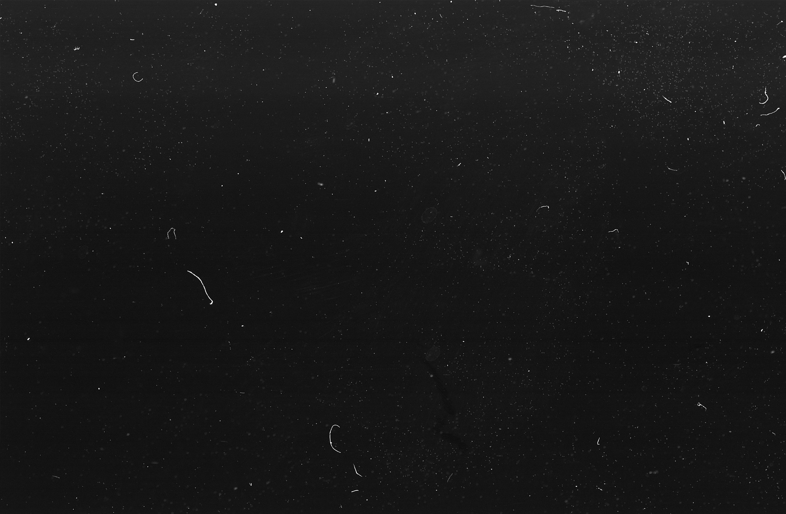
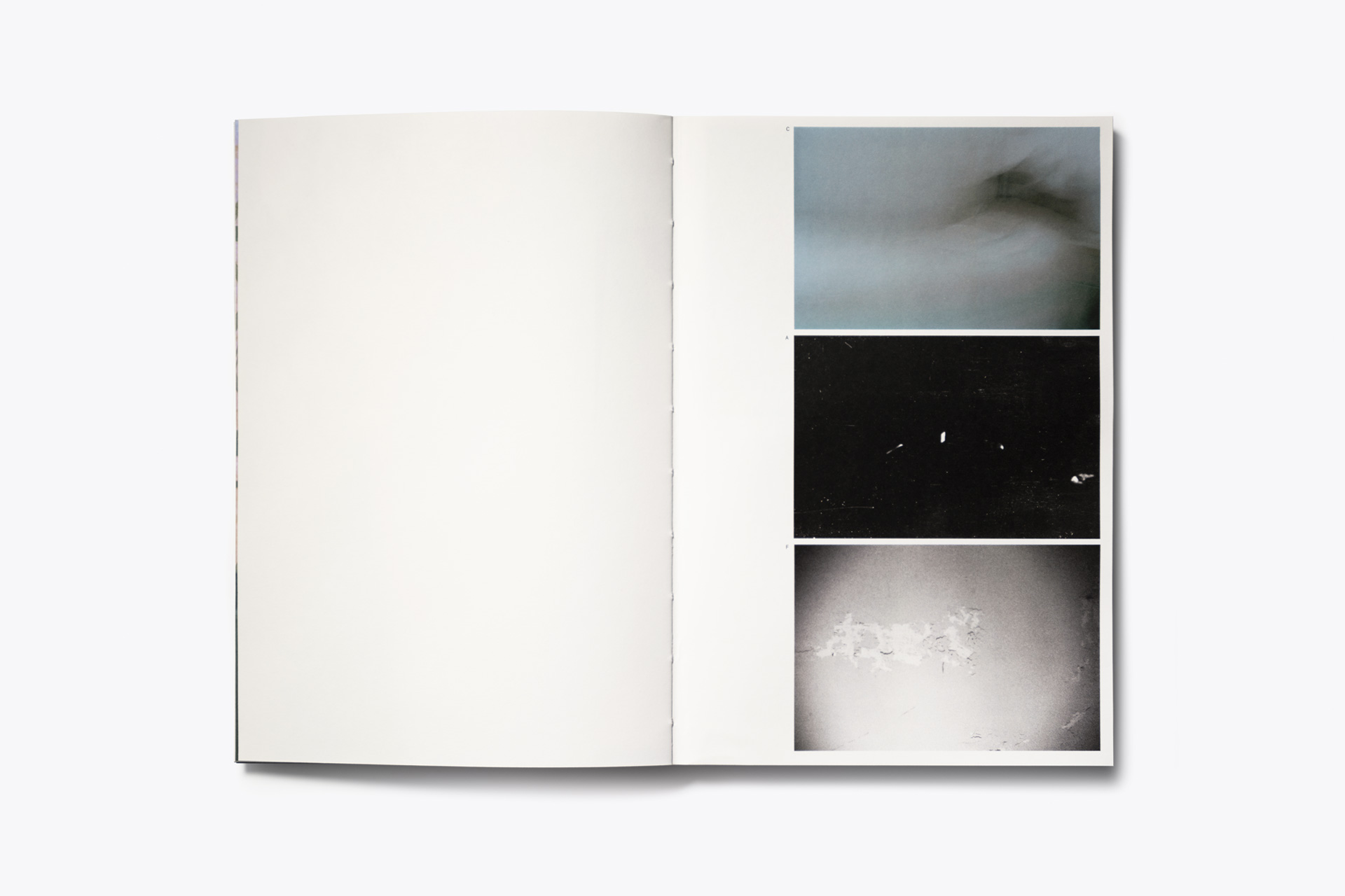
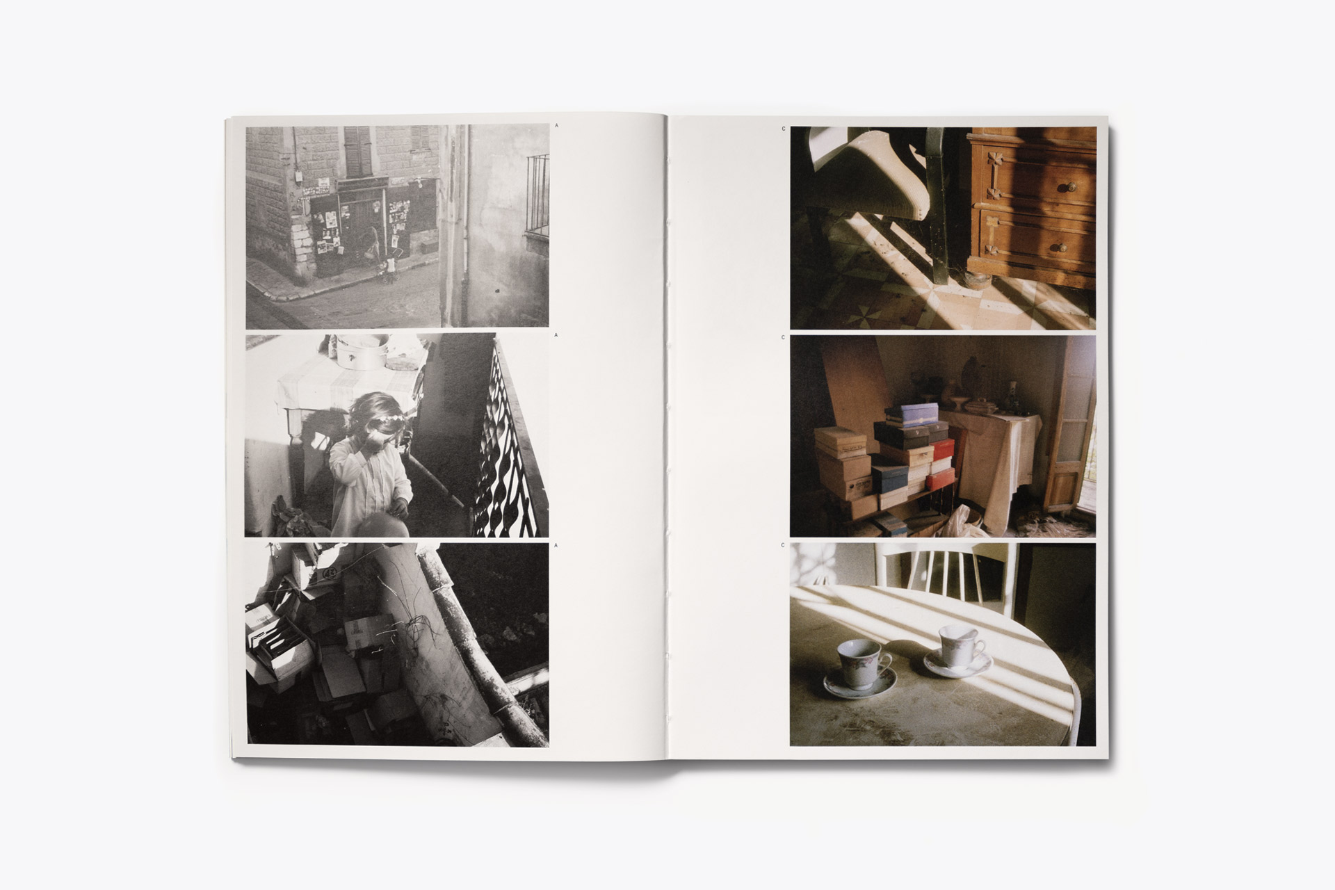
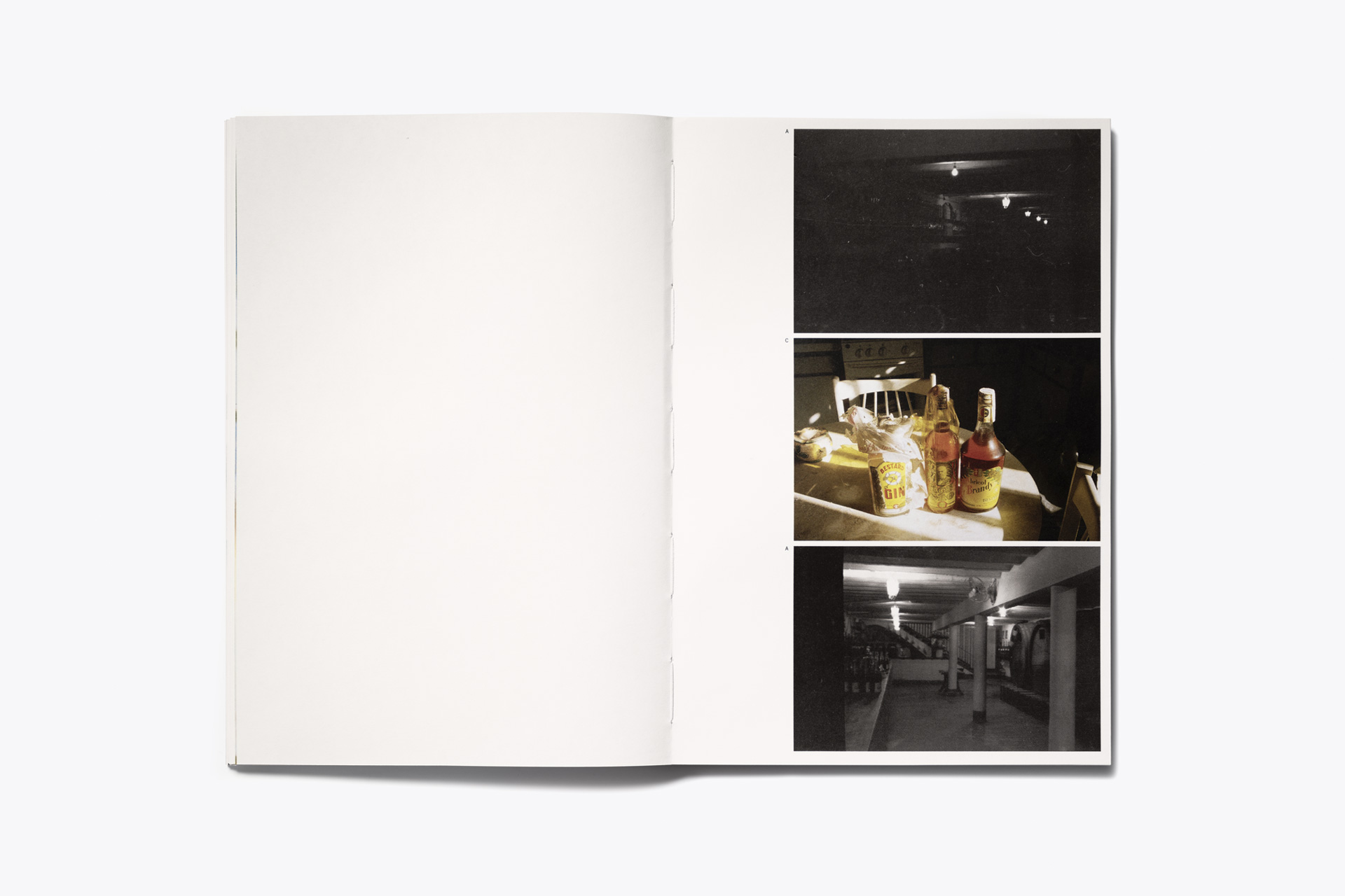
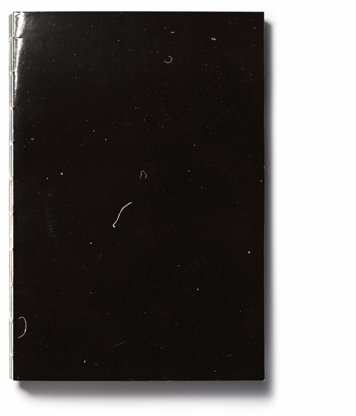
Quoting Cati herself “The dust, which accumulated on a photographic negative became the cover of the book, indicates the absence of people, surfaces untouched for decades, and the accumulation of other substances. But there is also a narrative void of complex stories, past lives, memories, and decisions, impossible to convey because they are as vast as they are unknown. The photographic image is a piece of a fragmented reality, a language with many shortcomings, like any other language.”

Ca s’abuela
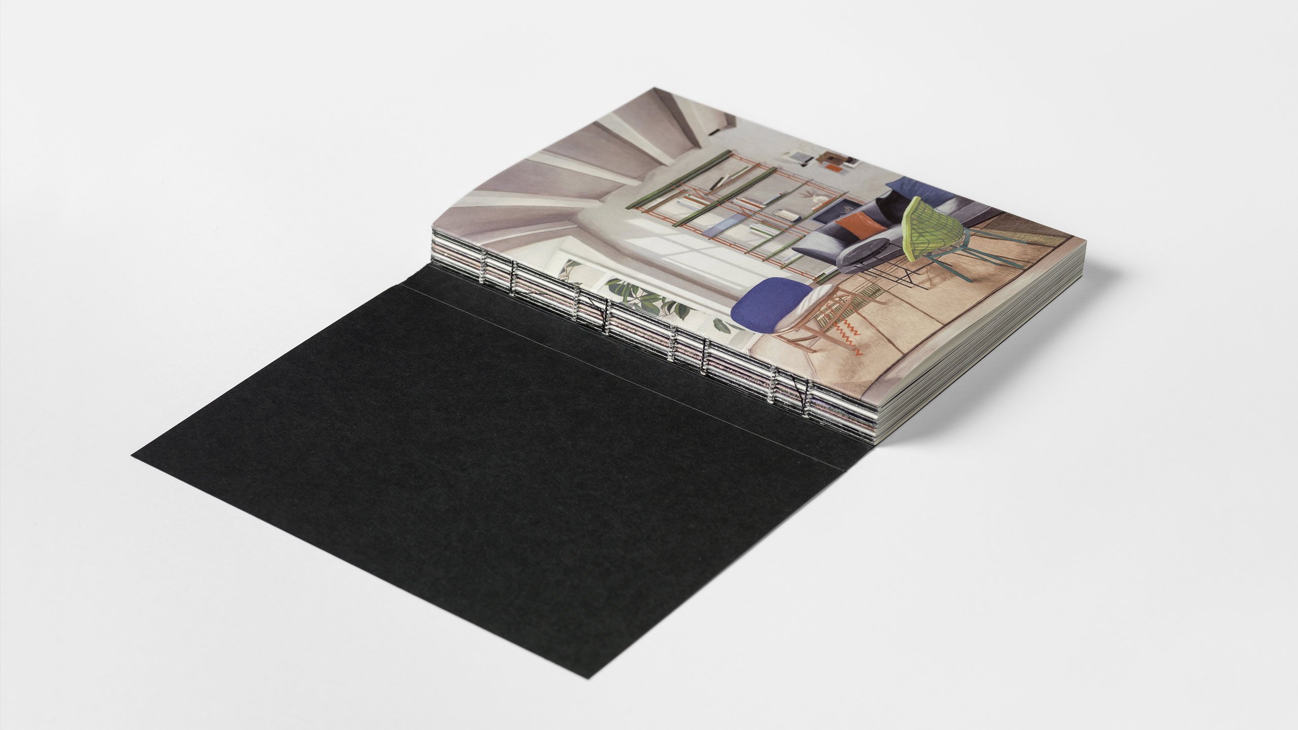
200 copies, 100 pages, 17 x 25 cm.

A project by Cati Bestard.
You can buy it here.

Fase, estudio de diseño gráfico. Identidad Castelló Poble 2030

Castelló Poble 2030

Castelló Poble 2030

Castelló is a town with 7,000 inhabitants located in the Ribera Alta region, province of València. In 2022, it was chosen as one of the pilot municipalities for the Spanish Urban Agenda, a program designed to guide the planning of Spanish municipalities and cities towards sustainable development.

Fase, estudio de diseño gráfico. Identidad Castelló Poble 2030, ilustración pueblo abierto

Fase, estudio de diseño gráfico. Identidad Castelló Poble 2030, aplicaciones
Fase, estudio de diseño gráfico. Identidad Castelló Poble 2030, tipografías

Fase, estudio de diseño gráfico. Identidad Castelló Poble 2030, lona obras
Fase, estudio de diseño gráfico. Identidad Castelló Poble 2030, web móvil
Fase, estudio de diseño gráfico. Identidad Castelló Poble 2030, guía
Fase, estudio de diseño gráfico. Identidad Castelló Poble 2030, bandera
Fase, estudio de diseño gráfico. Identidad Castelló Poble 2030, vinilo
Fase, estudio de diseño gráfico. Identidad Castelló Poble 2030, camiseta
Fase, estudio de diseño gráfico. Identidad Castelló Poble 2030, mupi
Fase, estudio de diseño gráfico. Identidad Castelló Poble 2030, guía
Fase, estudio de diseño gráfico. Identidad Castelló Poble 2030, ilustración próximo

Fase, estudio de diseño gráfico. Identidad Castelló Poble 2030, lona obras
Fase, estudio de diseño gráfico. Identidad Castelló Poble 2030, aplicaciones
Fase, estudio de diseño gráfico. Identidad Castelló Poble 2030, web
Fase, estudio de diseño gráfico. Identidad Castelló Poble 2030, ilustración pueblo inclusivo
Fase, estudio de diseño gráfico. Identidad Castelló Poble 2030, valla

Due to the historical conflict surrounding its toponymy and the recent decision to be called “Castelló,” there was a need to propose a name for the Agenda that would encourage the use of this term and distinguish it from the capital of the province. Thus, “poble” (town) was added to reinforce its identity, and “2030” was included to link it to the program.
On the other hand, the multitude of concepts related to the Urban Agenda and the UN Sustainable Development Goals require simplification for effective communication. Therefore, five strategic areas have been established that align with the objectives of the Spanish Urban Agenda. This way, the chosen name allows us to replace “2030” with adjectives that define each of these areas: prosperous, healthy, nearby, inclusive, and open.

The graphic identity is led by characters representing these areas of action, each assigned a specific color in addition to yellow, which is used for generic communications. The typefaces, with simple and open forms, are familiar and work well across all types of applications and media. Finally, the logo is a straightforward identifier that combines update and recycling icons with the letter C.

Website: castellopoble2030.com

Illustrations: Josep Navarro
Web design and coding: Mui Studio

Typefaces: Feliciano Type

Fase, estudio de diseño gráfico. Identidad Permea

Permea

Permea

Permea (Experimental Program for Mediation and Education through Art) is a master’s program created by the Consorci de Museus de la Comunitat Valenciana together with the University of Valencia. It addresses in a holistic and experimental way the knowledge involved in the creation of artistic mediation projects, both in the institutional spaces of art and education as well as in other social contexts.

Fase, estudio de diseño gráfico. Identidad Permea

Fase, estudio de diseño gráfico. Identidad Permea

Fase, estudio de diseño gráfico. Identidad Permea
Fase, estudio de diseño gráfico. Identidad Permea, cartel
Fase, estudio de diseño gráfico. Identidad Permea
Fase, estudio de diseño gráfico. Identidad Permea, carteles
Fase, estudio de diseño gráfico. Identidad Permea

Fase, estudio de diseño gráfico. Identidad Permea: Guía Docente
Fase, estudio de diseño gráfico. Identidad Permea: Textos Permeables

The graphic identity had to reflect the character of the master’s degree, less childish and festive and more theoretical and intellectual. To achieve this, we proposed a contemporary graphic identity that invites students to intervene in it through images that are generated during the course and that do not require large resources in production.

The identity is structured through a single typeface, Oblong Sans, a friendly grotesque that through a subtle inverted contrast and other unusual details, manages to offer the right space for experimentation and play, while offering a contemporary image. In addition, in order to communicate the idea of dialogue, some titles are placed as if it were a conversation.

On the other hand, the identity makes use of transparency in several applications. Texts and images from a different nature are mixed with color masses seeking to enhance and take advantage of the program’s name, as well as reinforcing the ideas of exchange and transmission that work as an allegory of mediation and education.

Fase, estudio de diseño gráfico. Publicación Los Dalton

The Daltons

The Daltons

The Daltons, is an exhibition project by Miguel Fructuoso, María Sanchez and Miguel Ángel Tornero curated by Dilalica and exhibited at Centro José Guerrero in Granada. Color blindness is the starting point to reflect around empathy, individualism and collectivity, and what is considered to be rare or common. The exhibition includes a series of formal and conceptual exercises in relation to color, to suggest that everything can be questioned.

Fase, estudio de diseño gráfico. Publicación Los Dalton

The Daltons
500 copies, 100 páginas, 17 x 23,5 cm.

A project by Miguel Fructuoso, María Sanchez and Miguel Ángel Tornero.
Curated by Dilalica for Centro José Guerrero.
Texts by Jorge de Cascante and Dilalica.
Photography by Aleix Plademunt, Toni Mori and Los Dalton.
Typefaces Capraia by CAST and Plain by Optimo.

Fase, estudio de diseño gráfico. Identidad La Unió Llauradora i Ramadera

La Unió

La Unió

La Unió Llauradora i Ramadera (The Agriculture and Livestock Union) is the largest professional farming organization in the Valencian countryside. It was born in 1976 to defend agricultural professionals and to be the interlocutor to the administrations and all the agents of the agricultural sector. Along with the renewal of the graphic identity, its name has been updated with the aim of reflecting the new, more inclusive and diverse nature of La Unió, changing “Llauradors i Ramaders” (masculine nouns) to “Llauradora i Ramadera” (adjectives).

Fase, estudio de diseño gráfico. Identidad La Unió Llauradora i Ramadera
Fase, estudio de diseño gráfico. Identidad La Unió Llauradora i Ramadera, postal
Fase, estudio de diseño gráfico. Identidad La Unió Llauradora i Ramadera, papelería
Fase, estudio de diseño gráfico. Identidad La Unió Llauradora i Ramadera, tote
Fase, estudio de diseño gráfico. Identidad La Unió Llauradora i Ramadera, portadas

Fase, estudio de diseño gráfico. Identidad La Unió Llauradora i Ramadera, varias aplicaciones

Fase, estudio de diseño gráfico. Identidad La Unió Llauradora i Ramadera, camiseta
Fase, estudio de diseño gráfico. Identidad La Unió Llauradora i Ramadera, revistas

Fase, estudio de diseño gráfico. Identidad La Unió Llauradora i Ramadera, banderas y chinos
Fase, estudio de diseño gráfico. Identidad La Unió Llauradora i Ramadera, cartel manifestación
Fase, estudio de diseño gráfico. Identidad La Unió Llauradora i Ramadera, carteles manifestación
Fase, estudio de diseño gráfico. Identidad La Unió Llauradora i Ramadera
Fase, estudio de diseño gráfico. Identidad La Unió Llauradora i Ramadera, XV Congrés

The graphic identity had to reflect the renewed character and values of the organization and try to connect with the new generations. We propose a typographic logo that joints the two words. The typeface, Original Sans links it formally to the trade union imagery. Seeking to enrich the identity and also as a functional element, we added a variant that has the full denomination and associates it to the food quality seals. The main typeface is Zoom Pro which with its imperfect geometric shapes provides freshness and spontaneity and, thanks to the variety of weights and widths, it allows the message to be modulated from some more formal to others more demanding.

We updated the green color that has represented the organization in recent years with a more powerful and recognizable hue, as well as adding a fresh and vibrant color palette. Finally, we commissioned a collection of illustrations to Luis Demano with the aim of emphasize the nature of the organization and to help with some applications and the brand architecture. They were drawn freehand with a marker, with an accessible but not childish style.

Illustrations: Luis Demano
Typography: Original sans y Zoom Pro

Fase, estudio de diseño gráfico. Publicación 15 years of Yonoh, portada

15 years of Yonoh

15 years of Yonoh

This publication celebrates the 15th anniversary of the Yonoh design studio, collecting 15 years of experiences, 15 of their favorite designs and 15 testimonials from people who have been part of their career. A few strokes of the work they have done until today.


Gold ADCV Award corporate publications and catalogs, 2022.
Bronze Laus Award corporate book, 2022.

A project by Yonoh Creative Studio
Text by Tachy Mora
Ilustraciones Koko Che Jota
Paper GF Smith Colorplan and Fedrigoni Arena
Typeface Diatype by Dinamo

Publication photography by Josep Gil

Fase, estudio de diseño gráfico. Identidad y packaging Be Dyverse

Be Dyverse

Be Dyverse

Be Dyverse is a cosmetics brand for young skin, born with the aim of guiding skincare towards more effective and sustainable routines. For this reason, it concentrates all the innovations of cosmetics in a reduced collection of products, which cover the key needs of the skin. Everything you need, nothing you don’t.

Fase, estudio de diseño gráfico. Identidad y packaging Be Dyverse

Our approach was to focus on a youthful and natural aesthetic that communicates a freedom and happiness feeling. The graphic identity and packaging design aims to link the use of its products with a moment of personal satisfaction, in addition to differentiating the unique proposal of the company within a saturated market.

Fase, estudio de diseño gráfico. Identidad Més Compromís

Més-Compromís

Més-Compromís

The graphic identity of Més is built looking for a balance between four adjectives that define this young and ambitious political project: solid, friendly, activist and diverse.

Bronze Laus Award poster design, 2022.

Project done together with Diego Mir.

Fase, estudio de diseño gráfico. Publicación Echo, Dilalica.

Echo

Echo

Echo is a body that listens, a body that speaks, a body that “thinks”. Echo only knows and can only use the words that she has previously heard, paying attention to how she hears them combine. Echo listens to you and responds to you. Echo sometimes says incongruous or unconnected things. Echo sometimes says things that make sense. Included in this publication is the automatic record of what Echo heard and said since she was born and during the period she was in Dilalica.

Echo
96 pages, 14 x 19 cm.

A project by Lúa Coderch, Julia Múgica, Lluís Nacenta and Iván Paz for Dilalica.
Text by Lúa Coderch.
Echo photography by Aleix Plademunt.
Illustration generated using ASCII code.
Tipography Chassi and Menlo.

Fase, estudio de diseño gráfico. 13 Crestwood Drive, branding.

13 Crestwood Drive

13 Crestwood Drive

13 Crestwood Drive is a luxury residential project located on the boundary line between Barrie and Oro-Medonte in Barrie’s coveted North Shore neighbourhood. The home is situated on a sloping hillside with mature hardwood trees overlooking the northern shore of Kempenfelt Bay.


We worked together with the Jorg team to find the graphic language that best suited the architectural conception of the residence. The logo makes a nod to the way in which the house adapts its form to the hillside on which it is built.

Visit the website at 13crestwood.com

Development: CLN Development
Architecture: Ancerl Studio
Renders and marketing: Jorg